Research
itch.io. 2021. Townseek by Whales And Games, JohnElliott, MoskiDraws, JorgeGameDev. [online] Available at: <https://whalesandgames.itch.io/townseek> [Accessed 21 October 2021].


Above is a good example of presentation I found during my research, this page is effective as it is very visually stunning to look at since it has a nice colour scheme/balance that is very eye catching and contains artwork to help break up the text. The banner looks really nice and the background is even animated which gives it a lot of charm, the page also gives key information about the game to the viewer such as a description, screenshots of the game and a short gameplay video. Overall this is a very good page as its unique and memorable and manages to do so while not being too large or overwhelming to the viewer.
itch.io. 2021. Swallow the Sea by ItsTheMaceo, Kondorriano. [online] Available at: <https://itsthemaceo.itch.io/swallow-the-sea> [Accessed 21 October 2021].

Above is another good example of presentation I found during my research, once again the colour scheme used it very good to look at and the dark colour scheme makes it easy on the eyes and it also fits with the theme of the game, it also has some nice artwork explaining the controls to break up the text which works really well. Screenshots and a trailer are used to help show off the actual product. The text gives a small explanation of the games story as well as how to install the game for those who may not know how to since ease of access is important for most products. The banner looks very simple but still good and fits with the games theme, it is also animated which makes it look more interesting and eye catching.
tch.io. 2021. Faerie Afterlight by claygamestudio. [online] Available at: <https://claygamestudio.itch.io/faerie-afterlight> [Accessed 21 October 2021].


Above is my last good example of presentation I found during my research, this page is a lot bigger than my previous example however it uses that space well as it contains a lot of images. The colour scheme is very nice and work with the overall mood of the page and looks very unique. It contains screenshots of the game as well as a trailer to show the gameplay, there’s also a chunk of text that explains the story with a nice piece of artwork above it and below is a graphic to demonstrate the controls for both keyboard and controller. While all the graphics/artwork is quite large it works since it allows the details to be better viewed. The only things its really missing is some gifs to add some moving aspects to the page but the page is still amazingly presented with them it would just make it that little bit better.
itch.io. 2021. Pirated Pirates by smitparmar. [online] Available at: <https://smitparmar.itch.io/pirated-pirates> [Accessed 21 October 2021].

Above is an example of bad presentation that I found during my research, the presentation is very generic and boring which then gives a bad first impression of the actual game itself especially when compared to the good examples I found as it has a plain white background and uses the stock font. It also contains no eye catching artwork such as a banner, the only good thing it contains is screenshots since its key to show the actual product.
Planning
Due to the timeframe I have left for my presentation and the limit of my skills I will try to make a simple but effective looking page for my game, I will do so by making sure to include screenshots of my game, a simple background, logo and banner, unique but relevant text font. I have decided that I will use my logo as the banner for my page and shall create it in unity since I would be able to create something more professional looking than if I were to draw it and it helps show how my game looks straight away. Next for the background I have decided that using a nice looking screenshot of background scenery from my game would look the best since it would once again help show what my game looks like while still looking good and being quite time effective. Then for the screenshots I have decided that three is a good amount to use as its enough to show off what your game will look like while not revealing too much especially since my game is quite short. Lastly for the font I will use look for a pirate font similar to that used in my game since it would fit with the theme of my game. Overall by doing this I hope to draw in more people to look at my itch page due to it standing out compared to other games on the site.
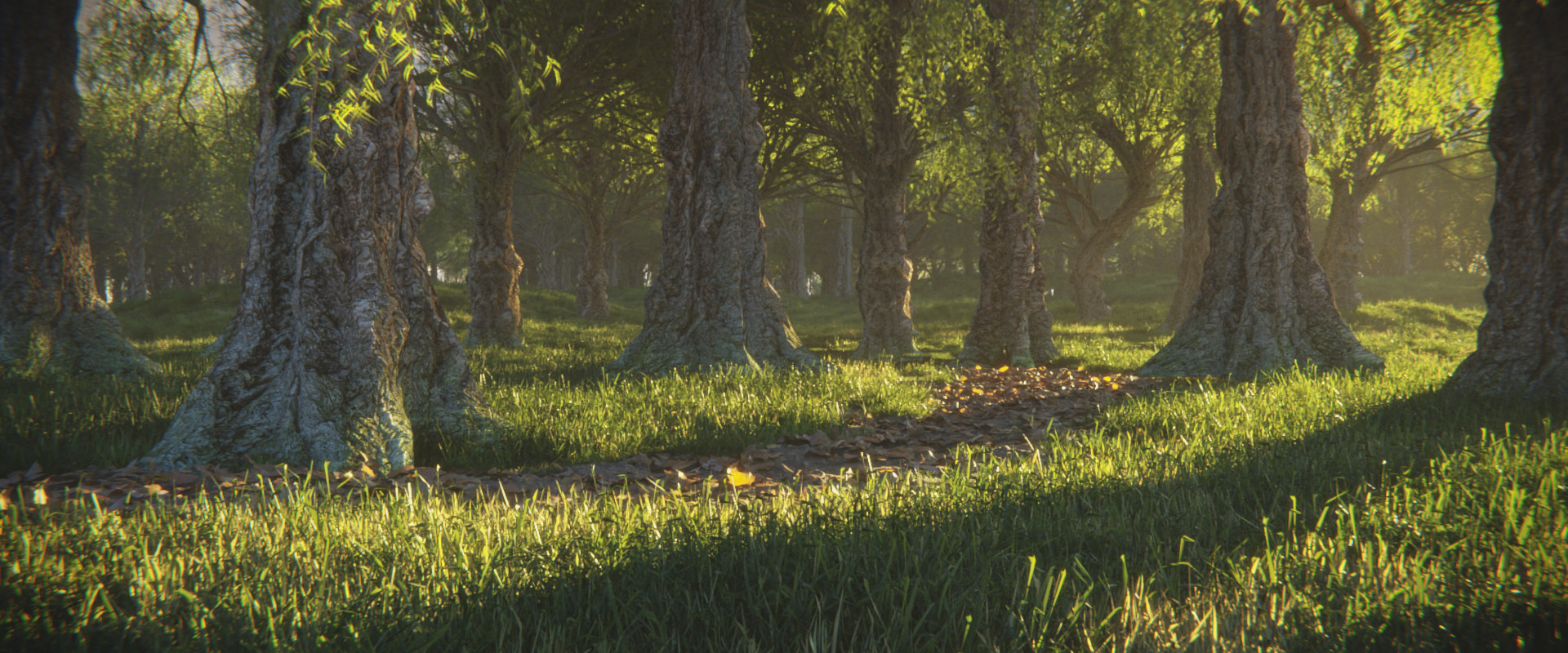
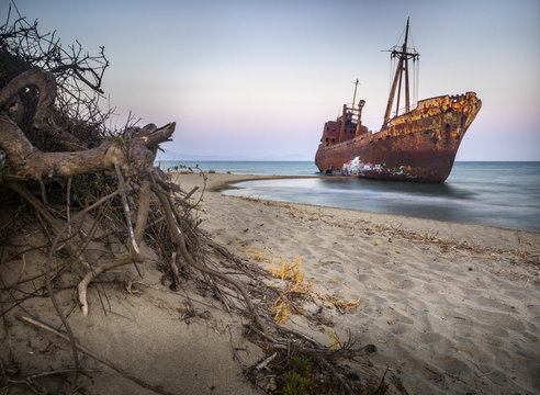
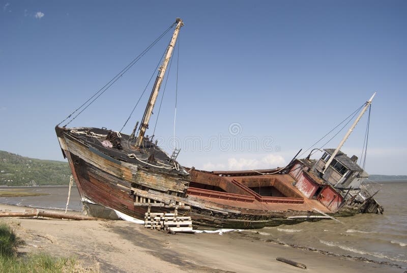
When creating my banner/logo I while I had an rough idea of what I wanted it to look like I decided to find some reference images to help me and drew up a very rough plan, I wanted a simple forest environment like that which I used in my game with a pirate ship crashed within the forest. I believe that this would look good and draw people in since it helps show the tropical and pirate theming of my game and also since a pirate ship being crashed in the middle of a forest is very eye catching and raises many questions which would hopefully lead to them checking out my game.

Implementation


To improve my presentation I updated my itch page with a logo, banner, screenshots and background since it made it look more professional than using the empty default appearance, it also helps to show what my game is before the player has played it which will draw in more people to try my game and since my art skills are not the best I decided that using unity for the promotional material would be my best bet whether its creating a new scene or using my pre-existing levels since it would look more eye catching than anything I could draw. The first thing I created was the logo and banner, I stuck to my plan quite closely and the only thing I changed was that I added a small forest at the top of cliff that was slightly visible since it helped make the background look less empty and added more overall life the the scene than I had expected such a small addition to make. Next I had to create a background which I decided that a simple screenshot of my forest and town from my first level might look pretty good so I tried that and liked how it looked as it went quite well with my banner so I used it, I also took three screenshots of my game, two from the first level and one from the third as I liked how each looked and they would be a good look at what my game is like. I also went and changed the font to the one mention in my plan as it was more fitting and unique than that of the default font that would better fit with the theme of my game and itch page. The colour scheme on my page looks alright as it doesn’t look bad but I could certainly have made it better if I had focused more on it which is something I will try to do in the future. With my implementation I achieved everything I set out to do in my plan as my itch page looks moderately simple but still interesting to look at and gives a good feel for what my is, the logo/banner also achieved everything I wanted it to as it looks very good and should be very eye-catching as mentioned in my plan especially since its my first time doing.
